Simple ways to show impact using digital solutions

This guide covers the following:
- What sort of data and information you might look to gather for your impact reporting.
- Useful tools for gathering data, and what you can do with the data once you have it.
- Tools and techniques for presenting data.
- Using digital tools to present stories and key considerations around gathering and presenting them.
Contents:
1.0 What are you measuring - outputs and outcomes.
2.0 How to gather impactful data.
3.0 Simple ways to present and communicate impact.
4.0 Telling powerful stories using digital tools.
5.0 Examples of good practice on the web, social and report formats.
1.0 What are you measuring - outputs and outcomes.
To get the most out of this guide an understanding of ‘impact practice’ and outcome frameworks is beneficial. To find out more you can read ‘Demonstrate your organisation’s positive impact’ on WCVA’s website).
There are a variety of outcomes and outputs an organisation can gather to demonstrate the impact of your work. Some of these may benefit from using digital tools to collect the information:
- Reach - Number of people who have been directly helped, seen information, heard about the programme, accessed a resource, etc.
- Quantity of provision - Numbers of people attending an event, receiving support, completing a course, viewing a piece of information.
- Quality of provision - Measurement of agreed metrics before and after intervention or programme (such as positive feedback, and key performance indicators (KPIs) achieved).
- Beneficiary experience - Stories of individuals’ experience with the organisation, photos and videos, quotes, and surveys of outcome indicators.
- Cost - Return on investment, changes from previous years.
This guide will show you some good tools and processes for gathering information, and how digital tools can support you with gathering stories or case studies to demonstrate the impact of your organisation’s work.
2.0 How to gather impactful data
Digital tools can be invaluable in helping gather data from both automated sources and from individuals who have benefited from or taken part in your programme. Some of the most commonly used tools are in the table below - some of which you might already have access to.
Analytics
What does it do?
Every website or online application (i.e. Facebook, YouTube) will usually have an analytics function. This monitors how people are using that website/application and gathers information about them. This can then provide you with reports and statistics that give you insights to help make improvements.
Type of information gathered
How many people visited a site or a particular piece of content. How long they looked at a page or watched a video. How many times a piece of content has been downloaded. When they leave the website.
Extra features
Analytics software can provide more detailed demographic information on the audience for your website or application, including where they are accessing your website, the type of device they use, possibly even age and gender.
Software examples
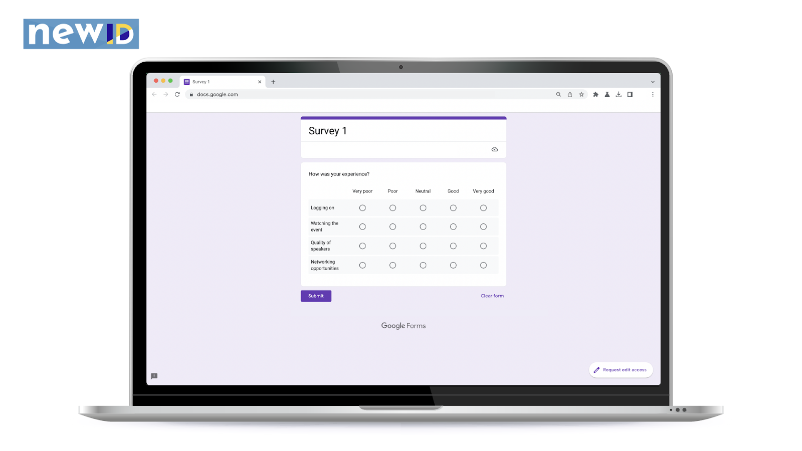
Forms
What does it do?
Online forms can be set up to gather specific bits of information, such as collecting feedback, setting up surveys, or gathering contact details. You enter the questions you want to ask, and decide what format you want the answers in, for example free text, checkboxes or a scale of 1-10. The form is then shared online and you can download collected responses and/or individual responses.
Type of information gathered
Demographic information about participants, such as age or employment status. Outcome-related questions - for example, has their well-being improved following the programme? Gathering quotes for case studies. Submitting pictures online.
Extra features
Forms can be quickly turned into charts and graphs for easier visual display of data.
Software examples
Mobile recording
What is it?
Modern phones can take pictures, and record audio and video. With a little training in how to take a good photo and the app tutorials, you can easily capture a rich variety of photos, videos and audio recordings to support your impact reporting.
Type of information gathered
Images of programmes. Beneficiary voices. Interviews.
Extra features
Media can be quickly uploaded from your phone and embedded into most office software or graphic design packages.
Software examples
N/A - Built-in device apps will perform well.
Video conferencing
What is it?
You can use video calling or conferencing software to interview people and record them for easier transcription and even share an edited version (with consent) as part of your impact reporting.
Type of information gathered
Beneficiary voices. Interviews.
Extra features
You can use the automatic transcription feature, available in many applications, to produce captions in English, Welsh and other languages.
Software examples
Zoom, Microsoft Teams, Google Meet (NB - Zoom and Teams support a live translator if needed)

How can you use this information?
Once gathered, this information can provide the raw data to demonstrate a number of outputs and outcomes against agreed metrics and KPIs - and be turned into visually engaging materials to easily communicate the impact made.
Case study - Sir Gaerfyrddin Malio
Sir Gaerfyrddin Malio provides grants for household furniture to families across Carmarthenshire. As part of their annual report, they wanted to demonstrate:
- How many families they were able to support
- How they raised awareness of the programme
- Where this support was delivered
- The self-reported outcomes resulting from this help
The programme lead collected different types of data to help demonstrate this. The person responsible for finance provided a spreadsheet report of all grants made in the area, including the type of item, postcode and value. The programme lead used this spreadsheet, filtering the information to produce graphs and charts showing:
- How many of each type of item was distributed
- Total value of grants made, broken down
- Year-on-year comparisons of both to show changes
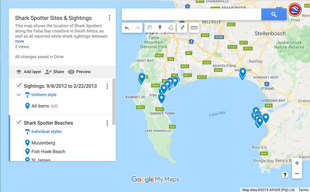
They also used the postcode data in mapping software to generate a map showing a spread of where grants had been made. They used statistical information from the ONS to create a ‘heat map’ of areas of low income so that it was clear to the reader how the grant provision intersected with likely need in that area.
The programme lead used information from a combination of Google Analytics (for website), Mailchimp (email statistics), and Facebook and Instagram (built-in analytics programmes) as part of the report. This allowed them to include statistics of how many people had visited the charity’s website, or seen something about the grants programme through the organisation’s channels. The lead was able to filter the data for demographic information, so that it only referred to those confirmed as being in the correct geographic area for their organisation.
The programme lead had already been sending out emails with links to online forms for families to fill in a month after they had received their grant, asking them to respond to questions on a scale, relating to what difference the grant item had made, e.g. ‘Has the item allowed your family to do things you couldn’t before?’ ‘Has the item reduced stress in your household?’. Where a family had not provided an email address, the programmes team called them to go through the questionnaire over the phone.
Using this information, the programme lead was able to generate charts demonstrating how successfully the families reported the grants had supported the agreed outcomes. The forms also included free-text fields for families to add in any general comments about the grant and attached pictures if they were happy to, with suitable assurances about usage provided. These quotes and pictures were used to bring elements of ‘family voice’ into the report.
3.0 Simple ways to present and communicate impact
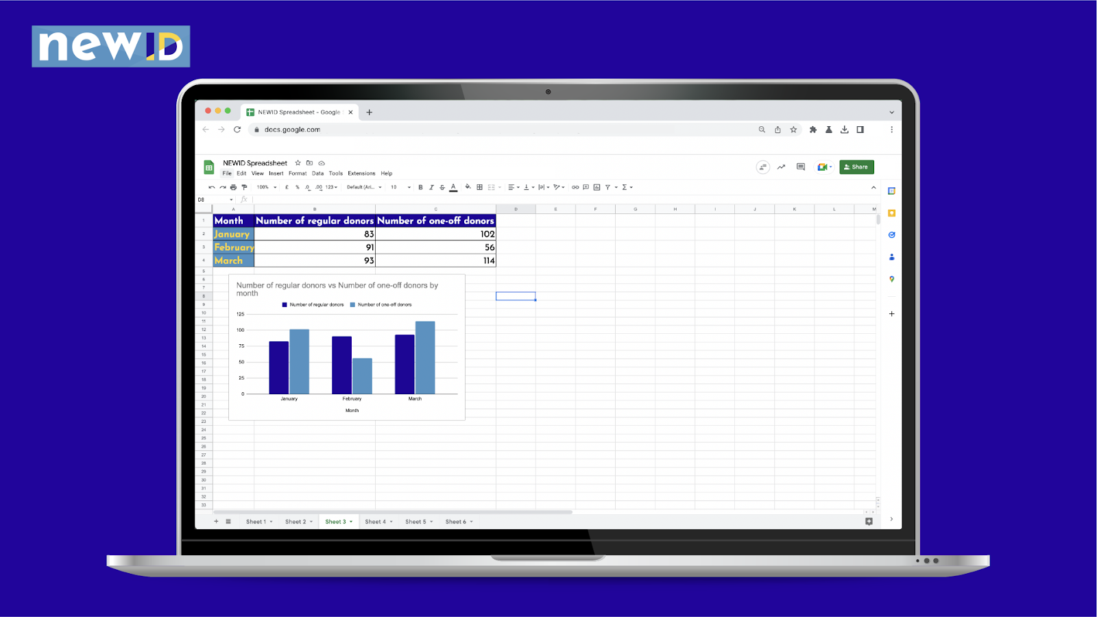
Spreadsheets
What is it?
Putting the data received via other tools into a spreadsheet is a good starting point for making use of digital tools for displaying impact. See Office Software topic
Type of visual information produced
Putting the data received via other tools into a spreadsheet is a good starting point for making use of digital tools for displaying impact.
Extra features
Can use analysis features to filter and examine
Software examples
Image editing tools
What is it?
Basic image editing is already available in office software applications such as word processors and presentations. Developing skills in online tools such as Canva can help you to produce higher-quality images with greater ease.
Type of visual information produced
Combine quotes and images to create more engaging case study representations. Crop photos to fit presentations.
Extra features
With more training, can use basic animation and transition techniques.
Software examples
Infographics
What is it?
nfographics are similar to charts or graphs, in that they present data in a visually engaging manner. But they are usually telling more of a narrative than a single chart, often incorporating illustration, data and minimal text, to convey ideas. Here is a fairly simple example from a charity in Sunderland.
Type of visual information produced
Create a holistic or overarching visual representation of impact. Create a story for a programme or element of data.
Extra features
Can start very basic with some text and simple diagrams, and go right up to more complex graphs and illustrations
Software examples
Mapping
What is it?
Software such as Google Maps can link with spreadsheet geocode or postcode data to populate a map and show the geographic spread of your work.
Type of visual information produced?
Location of work. Overlay of work against other metrics i.e. indices of deprivation.
Extra features
Map information can be colour-coded to highlight the range of work.
Software examples
4.0 Telling powerful stories using digital tools
As crucial as robust, evidence-based statistics are for demonstrating impact, it can be hard for them to resonate with a reader unless they’re accompanied by the voice and stories of your beneficiaries. This is important not just to encourage empathy, but also to ensure those people are represented and their experience of your organisation is central to any narrative of its impact.
No story without numbers. No numbers without a story.
One of the major benefits of the current crop of digital tools is that it is now easier than ever for people to share their stories across a variety of media. Beneficiaries can:
- Complete online forms
- Send emails
- Record an audio message and share it digitally
- Film themselves or take photographs of themselves and share these digitally
- Take part in a recorded video or phone call
Things to consider
What does your story need to show?
- A story should reflect the human side of what your programme delivers and make your intended audience(s) understand what difference you have made and empathise with the person telling the story. Although it should contain the essential facts about how they were helped, it is important to also provide the broader context. Questions to ask might include:
- Why did they need the programme?
- How many people in the family benefited from the programme in one way or another?
- What would have happened if they had not been able to receive support?
- What difference did it make to them?
- How did it make them feel?
- What is the lasting impact on their lives?
Who is telling the story?
- Your beneficiaries are your most powerful advocates, but you need to consider a number of factors before selecting their stories for wider sharing:
- Make sure they are in a suitable frame of mind and situation that doesn’t put them at risk, or in an uncomfortable situation if their story is shared publicly where people they know could see it. If in doubt, approach somebody else.
- Do you or someone in the organisation know them already? Do they have a sense of whether they would be able to speak or write about their story well?
- Review what you know about them and the support they have received. Is it reflective of the programme? Do they have a compelling story based on their background and what difference the programme has made?
- An initial chat may be helpful to get a sense of whether they would be able, and happy, to tell a full story about their experience.
- If it’s appropriate for your needs, offer them the chance to be anonymised.
How can you ensure informed consent?
- Helping people understand how their story is used, and consulting with them throughout the process will ensure trust on both sides, and that they feel in control and more comfortable with taking part. This will also be valuable if you want to go back and work with them in the future:
- Explain at the outset how and where their story will be used.
- Make sure they can review and approve their story before it is published.
- Create an easy-to-read consent form that explicitly outlines all the different ways it will be used, and separates out the use of text and images/video, in case they are comfortable with one and not the other. The form should also specify how long you will use the story.
- If the story is about a child or young person, their parent and carer must be fully involved in the process and provide consent on their behalf.
How can you help people tell as full a story as possible?
- Have several standard questions to capture the essential information you need, but be prepared to follow up with questions - either in conversation or via email - to draw out particular details.
- Ask them to explain any elements of the story that are not clear, or might not be clear to someone that doesn’t already know them or the programme.
- It can help, if people are stilted or nervous about talking, to get them to describe what happened as if they were explaining it to a friend.
- Encourage people to talk/write for as long as they want.
- Record the conversation if you are writing up their story, to ensure you capture everything accurately.
Gathering and sharing your stories
You can also record or photograph your beneficiaries using your organisation's equipment. If you have more advanced skills or equipment such as professional cameras or microphones that is an advantage, but even a standard smartphone will produce good results - and may even benefit from an ‘authentic’ or ‘unfiltered’ style of presentation if framed appropriately.
When gathering images, videos, audio and quotes to use you will need to get written consent from the person or their guardian to use them.
These tools make it easier to get a range of materials for each person’s story. And by using pre-existing templates (if you do not have access to dedicated graphic design resources) you can present the raw materials in an engaging visual way. Even basic office software such as PowerPoint will allow you to put a quote over a picture (see the example below), or you can use templates from free software like Canva.
You may also choose to present elements of your impact reporting online - allowing you to make the most of any audio or video assets you’ve received as part of your story-gathering. A simple webpage with all the information in one place may be a useful supplement or alternative to a PDF or other document.
However you do it, think about the audience(s) that needs to see it and make sure that you are using the format that will make it most accessible to them.
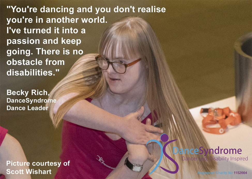
(Extract from a longer case study - from dancesyndrome.co.uk)
5.0 Examples of good practice on web, social and report formats
Charity Water: Charity Water’s website makes good use of up-to-date information on the number of projects they support and how many people this has helped. They provide photos and GPS coordinates for every project and use mapping software to display the location of their projects globally.
Girls Who Code: This annual report from the US-based organisation excitingly presents key numbers, backed up by lots of engaging photography, within a narrative that stresses achievement and context for outcomes. Although developed by a team with extensive design skills there are still some ideas that can be borrowed around the presentation and using lots of imagery with shorter, punchier text.
Tableau Foundation - Although not particularly ‘flashy’ from a visual point of view - Tableau Foundation’s annual report is notable for being a living annual report, where the data is updated every week, showing an ever-evolving update of how their work is progressing. Once you have set your templates up, and if the data is easily accessible, this is potentially replicable on a smaller scale. You could even do it monthly, or bimonthly if monthly is too much of a stretch.
Summary
You will be best placed to know what your audience and funders need to know about your work, but with the use of the digital tools outlined here, you can make sure you are presenting a wider range of information more easily and efficiently.
Most of the tools and applications listed in this guide are quite straightforward to use and can produce you with useful data and information with only a small amount of training. However, taking the time to learn how to use some of the more advanced features will help you to improve your data-gathering, and give you a variety of attractive and engaging ways to present that information to interested audiences.
Although the extra data and information that can be acquired using digital tools can be valuable in providing a wider context for evidencing impact, do not forget the importance of continuing to use stories, quotes, photos and other media from those your work has supported. Digital tools make it easier than ever for people to share their stories and experiences, and when used as part of an overall engagement plan with beneficiaries, can ensure that the human element of your impact is not overlooked.
Additional information
Further reading
Information is Beautiful - This website is a useful source of inspiration for different ways in which data can be presented in a compelling and ‘beautiful’ way.
Charity Digital - Six impact reports to inspire you - A helpful collection of web and document annual impact reports from different charities that may provide new ideas for presenting your work.
NCVO - Impact and evaluation - Resources and guidance to support developing effective impact and evaluation practice in your organisation
Venngage - How to make an infographic in five steps - This guide from software company Venngage is both useful for planning and making infographics, but includes principles that are good to apply to your impact practice generally.
Glossary
Analytics - A piece of software that connects to a website, platform or social media channel to monitor user behaviour and produce reports and data. Some of these analytics programmes provide further features allowing you to analyse the data produced.
Heat map - This is a mapping technique that uses an overlay of colour across a standard map to signify different values across a range. For example, you could have a map of a city, with different colours on a spectrum ranging from dark to light representing property values, with darker colours covering more expensive areas and lighter colours representing less expensive areas. This technique is also used sometimes in website analysis, to identify user activity on a page.
Mapping software - A software application that allows you to add extra notes or layers to an existing map. This can include markers to signify points of interest, or coloured layers or line to mark out one area of a map from another. For example, you could shade certain areas as a ‘heat map’, to indicate where you offered services, and use markers to identify where you had provided them.
Outcomes - Outcomes are the change that occurs as a result of an activity. For example, the outcomes of a training programme might be that a participant had gained confidence in a subject, was able to apply for jobs in a related discipline or reported increased well-being.
Outputs - Outputs are the quantitative results of activity - the things that are produced. For example, the output of a training programme would be the number of people who have completed a course or achieved a qualification.
Qualitative - A term used to refer to information that is descriptive in nature, and usually refers to things like records of people’s experiences, opinions, or analysis. It is used to provide colour and context alongside statistical or ‘quantitative’ data.
Quantitative - Refers to data that can be measured and ‘quantified’, usually numbers-based.
This guide was written by Brightsparks.
Like this post? Click below to share: